Author Thread Comments Made During the Challenge
Post actions
Post actions
Lots of people born in the same year as me. We should form a club.
Post actions
best year of my life ! Little too much blur for me. 7
Post actions
a little too out of focus
Post actions
Love the idea and the year was a fun year! The image is just not very sharp which distracts from the photo.
Post actions
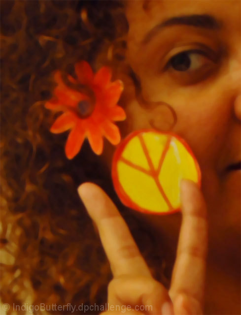
Nice elements, flower, peace sign, hand, curls, face, eye, nicely combined, interesting crop. But the image is just too blurry everywhere. Most viewers, including me, want to see at least some detail sharply in focus, otherwise it just becomes blurry and annoying, especially for something with nice elements, potential and promise.
Post actions
While it may have been intentional to be oof, because of the "acid", but it doesn't work for me. I don't like the cropping (face cut in half) either.
Post actions
the photo is a cool idea but it is blurry-probably intentional. i think it would look better if it wasn't blurry.
Post actions
wish it was not this blurry...looks like u took a picture of a poster..otherwise, a nice crop!
Post actions
..you could have been more psichadelic than this..
Post actions
Picture is badly oof. Color cast is too red. Crop is too tight.
Post actions
Cool idea, but the photo looks blurry.
Post actions
I love the colors, design, and close crop. I think it would be better if the focus was sharper.
Post actions
Focus is too soft for my liking.
Post actions
nice concept - seems OOF...maybe that was the look you were going for? :)
Post actions
Your model looks like she is straight off of Haight & Ashbury. The yellow peace sign comes off a bit hokey and unreal (cut from paper and taped on?) but the rest of the image is extremely evocative of the period. 6
Post actions
The concept is good. Unfortunately the focus seems a bit off.
Post actions
Post actions
Really blurry / out of focus. Maybe its on purpose to convey the acid trips.
Post actions
Great idea but the lack of focus detracts from the final product.
Post actions
would have liked to have seen this in a bit more focus.. but may be that's not what you were going for..
Post actions
Focus seems off and there seems to be color cast.
Post actions
I like the idea , maybe the Acid was why nothing was in focus? Not sure. Could have seen more of the face and hand. Like the colors though. 5.
Post actions
Gotta turn that peace sign rightside up... This pic does bring back a few memories, though :-)
Post actions
For me, if your photo was a bit more focused - either on the peace sign or the face I would have scored it higher. Good idea to represent the ear though.
Post actions
Post actions
Post actions
Post actions
The photo is unfortunately out of focus.
Post actions
I don't like picture that don't look natural.. In my opion you overdid it with filthers.. however, the idea and composition are very good.. meets the challenge.. 6
Post actions
Yes, we can't forget the acid. At first, I wasn't sure about the softness but the more I look at it, the more I like it. 7
Post actions
Interesting photo - a bit orangey. Curious about the up-side-down peace sign?
Post actions
maybe to be out of focus is your wish... but in this case imho it doesn't fit
Post actions
would have been good had it been in focus
Post actions
That as well? This is also my vintage ... June anyone?





 Add photograph to your favorites
 Add photographer to your favorites


 Photographer found comment helpful.


