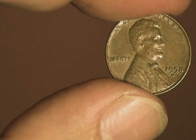
Hmmm.. it meets the challenge, but I find it lacks a "story" or that it says anything about you, or the era... As is, would have made a tighter crop and enriched the hues.
The image is a little drab and the eyes are continually drawn to the thumb both due to its relative size in frame and it's brightness which pushes the penny to secondary importance.
Nice photo of a penny. The overall image doesn't say much to the view, except "here's what a 58 penny looks like". The fingers don't add to the shot, and the nail chip detracts. 4
Good composition, but I think I would have liked it better with a little more finger on top to frame it out. Also about the background color...I think it compliments the coin very nicely.






 Add photograph to your favorites
 Add photographer to your favorites


 Photographer found comment helpful.


