Nikon D50
2006/11/20 23:02:39.7
Compressed RAW (12-bit)
Image Size: Large (3008 x 2000)
Lens: 18-55mm F/3.5-5.6 G
Focal Length: 20mm
Exposure Mode: Programmed Auto
Metering Mode: Multi-Pattern
1 sec - F/3.8
Exposure Comp.: 0 EV
Sensitivity: ISO 200
Optimize Image: Sharp
White Balance: Incandescent
AF Mode: AF-A
Flash Sync Mode: Not Attached
Auto Flash Comp: 0 EV
Color Mode: Mode IIIa (sRGB)
Tone Comp.: Auto
Hue Adjustment: 0°
Saturation: Normal
Sharpening: High
Image Comment:
Long Exposure NR: Off
Statistics
Place: 69 out of 102 Avg (all users): 5.4295 Avg (commenters): 5.0625 Avg (participants): 5.0980 Avg (non-participants): 5.4980 Views since voting: 853 Views during voting: 482 Votes: 298 Comments: 16 Favorites: 0
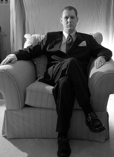
Good idea and pretty good execution, interesting lighting. I also had a problem with wrinkles/creases on my backdrop, and wished for a bigger room for DOF separation, or advanced editing.
Crop is a little tight on the fingers and toes. (Maybe that's a result of dealing with the mob.) ;-) I like the desat and the lighting except for the obvious bright light right behind the chair. Otherwise, good tonal range throughout.
I usually don't complain about wrinkled sheets as backdrops (sometimes they add texture), but for me, you may have gotten away with this one if the sheet crossed all the way to the left frame, I realize cropping his hand out wasn't an option but the left side becomes a big distraction from the well-posed subject. This idea has a lot of potential for a reshoot (maybe lose the backlighting on the right too). Good Luck 7
whats going on with the sheet in the background? and the lighting. this needs a little help. Maybe closer in and a larger aperture would help. and iron your sheet :)
The background is distracting...ie. where the sheet ends. Would have liked more atmosphere in this...less bright and light. Maybe if the light was one-directional and the figure was in half shadow..? dunno.
Dude... so close. Iron your sheet and at least have it cover the whole background, maybe too much light too. -2 for those items. Nonetheless awesome idea, 6.
Decent portrait beginning. The pose works for the Godfather and you have some decent detail in the suit and chair with the lighting set up. The problem comes in the backdrop (only partially covering and very wrinkled) and the strong backlight to the right of the chair (bright light pulls the eye toward it, in this case away from the subject.) Keep trying, you've got a good beginning. 4
Looks like all my photos where I hang a sheet up for a backdrop and no matter how much I stretch it I can't make it wide enough and can't get the wrinkles out. Good lighting although maybe the eyes could be a little brighter and open, and the backgound light is way to visible on his left shoulder. Hands don't look natural and foot is cut off. Otherwise good interpretation and composition.





 Add photograph to your favorites
 Add photographer to your favorites


 Photographer found comment helpful.


