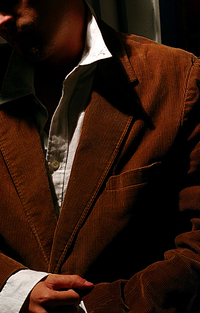
The lighting does help with the mood here, although there is some detail loss in the shadows. But the composition is lacking. The natural lines in the photo lead the eye to the tip of the 'V' in the jacket, which is right where the "rule of thirds" says the center of interest should be. But that isn't really very interesting. The parts of the photo that express the subject "crestfallen" are the face and clenched hand, and these are too close to the edges of the image. I think the photo would have been more effective cropped at about his chest (avoiding conflicting centers of interest) and with a little more face showing.
I'm not sure where the title comes in play, though it looks kind of like he may be pouting? or sticking out of the tongue.... the crop may have removed that aspect. Great lighting on the jacket, marvelous detail. To be honest, I would suggest cropping out more of the left side, so that pout/tongue whatever isn't in the shot, just the jaw. I am finding my attention is captured very well by the detail of the jacket and his hands - a strong masculine image. 7
Not bad. The redness behind the thumbnail takes away from this picture, even though I realize that the title is Crestfallen. Coat lapel on model's right side seems to be out of focus. I like how you framed your subject. Good lighting.
I really like this shot. Almost a fashion style shot, but the lighting is dramatic and creates a nice texture on the jacket. Great pose, too. Good luck!





 Add photograph to your favorites
 Add photographer to your favorites


 Photographer found comment helpful.


