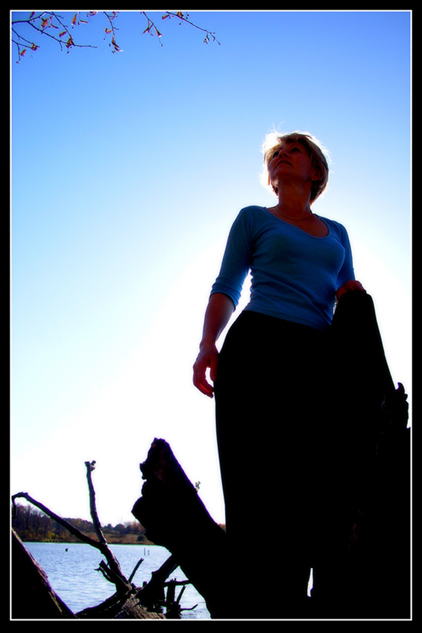
Nice, but would work much better IMHO without the clutter lower left, so it's just the model and the sky (and perhaps the leaves at the top). Like the 'halo' around the head and the graduated sky.
The backlighting has a nice effect, but I'm glad you used fill lighting to keep the model from being a silhouette; that would have been rather boring. But the silhouette treatment of the bottom part of the photo works well. You've really controlled the light well, and that was the goal of this challenge! I think the branches at the top add a nice touch; the model is looking up and it shows that there is something up there to look at.
I love the perspective and the color. Those two made the biggest impact on me. The use of light is good, I do like the backlighting, but as with many 'people' images, I wish I could see the face better. Also, I think removing the branches at the top would enhance the image bring out the blue aspect all the more. The focus looks good as does the overall composition. 6
Nice work.
I was looking at the composition and I would have cropped that annoying branch out at the top. And maybe more of the one at the bottom left.





 Add photograph to your favorites
 Add photographer to your favorites


 Photographer found comment helpful.


