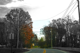
Too samll. Also an image of a road with power lines so prevalent does not make for the most pleasing image. Great composition, but you need to realize that the lines and street signs are not something that many would consider an excellent subject.
You might want to read the tutorial on sizing, I'm sure you'll fare better scorewise if you do so. My husband had the same problem with his first entry.
You probably heard this before: it's small, the sky is burnt out, the wires are disturbing, it misses color on the trees. 2 because the curved road with the opening between the trees, as a theme, is not that bad.
Too small, why is it partly grayscale? That does not work so well. Lots of power lines. I think you have some good color in the trees, this is advanced editing so I would get some of the power lines out of the photo. I like the curve of the road and the white fence. If you go to learn /tutorials you will find a tutorial on how to set up your photo for dpi, you tend to get marked down a lot for small photos makes it hard to see what is up. Well good luck.






 Add photograph to your favorites
 Add photographer to your favorites


