This really is better than it's score belies - the competition was tough in this challenge and who knows which image came right before yours in voting?
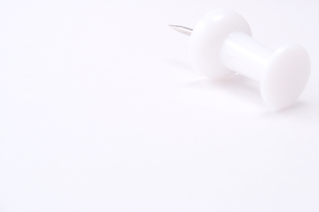
Wow. Pushed the envelope on this one with regards to visibility of the subject. :D If you had adjusted this to where the "pin" part of the pushpin was clear and focused (it's focused now, but noisy and muted) this photo would be stronger IMO. Yes, the pushpin would have been more defined as well, but being as it's white I don't imagine much impact would've been lost. All JMO of course. Good luck in the challenge.
Well placed object but the lighting is such that it took me a while to even see the pin. It did look better on my Mac Laptop screen. A little more shading would be more to my liking.
Although some might find the push pin body too soft, I am not bothered by that, as I assume it was intentional. What doesn't work so well is that the most vibrant part of this - the metal pin portion- naturally becomes the subject as the eye is drawn to it first. Due to its position, the eye then goes straight out of the photo. I'd like to see this with the pin rotated and the metal tip pointed down into the photo.





 Add photograph to your favorites
 Add photographer to your favorites

 Photographer found comment helpful.


