Author Thread Comments Made During the Challenge
Post actions
really lovely sense of design, perfectly integrated text. 10
Post actions
I wish the postcard text font size is bigger.
Post actions
My fave in this challenge ! Gave it a 10 days ago, came back to leave a comment. I hope it does well.
Post actions
the lettering is a little hard to read...good color
Post actions
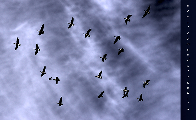
I'm having a very hard time reading the text on the right and actually have no idea what it says. If I ignore that, I love the birds and sky! There's one bird bottom left that looks almost like an airplane in the background. The texture in the sky is really wonderful.
Post actions
Nice shot, but the "" image title and hard-to-read font are irritating, please help us.
Post actions
Lovely photograph - text is difficult to read at this size, though.
Post actions
Pretty picture, but if you're going to put text on the postcard, be sure it's easily read. I can't tell what the last word is.
Post actions
Unfortunately, I can't read the print, which is really important is a postcard challenge!
Post actions
I love this and the layout is excellent. Having a tough time reading the words however. Nonetheless... excellent effort.
Post actions
The text is hard to read. It needs a cleaner font.
Post actions
An intersting picture. The text is totally unreadable.
Post actions
I like how you arranged the birds like that ;>þ
Post actions
great photo - love the complete coverage of the birds
Post actions
I'm having a very difficult time reading the text, since it's small and also a more whimsical font. I like the idea of the top to bottom text though, that is a unique twist. I'm also not sure what the photo has to do with the location (since I can't tell what the location is), but there is definately an interesting sky in there!
Post actions
Lovely photo! I can't read the words, though. I love the tones in the sky!
Post actions
That text is far too small and hard to read
Post actions
The text on the left is very hard to read.
Post actions
can't read the text on the right. is it New Richmond Wisconsin?? Interesting view of the birds, and interesting cloud formations, though
Post actions
the text just isn't working for me. i have no idea what it says because it is too small.
Post actions
Hate to say it but I can't read the text.
Post actions
Good capture of the birds and the sky provides a nice background. Placement of the text is good, but the font chosen and font size makes it difficult to read.
Post actions
I can't read the caption, so I don't know what I am seeing.
Post actions
text is very hard to read ...
Post actions
The text chosen is a bit hard to read and seems like a run-on word (all one word). Score: 5.
Post actions
font is too hard to read and it needs a title
Post actions
I find that text really hard to read.
Post actions
Good capture, but I'm having a hard time reading the text. Too small for seniors. 8(
Post actions
It's pretty hard to read because all of the letters are spaced apart the same, the text is small, and it's diagonally. But it's a very creative shot.
Post actions
Cool display of the birds. Nice sky. I wish I could read the writing.





 Add photograph to your favorites
 Add photographer to your favorites


