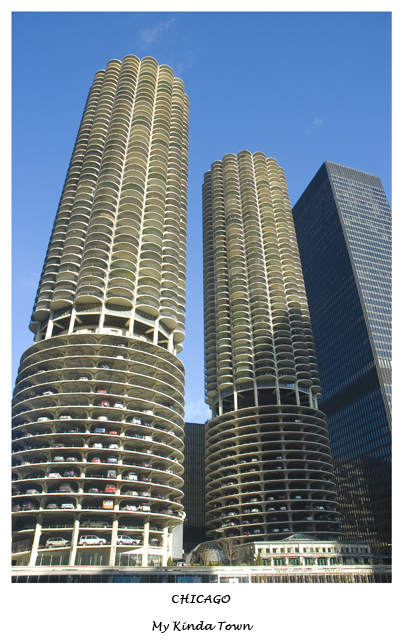
The Marina Towers are quite interesting. I think that a lower perspective might be more interesting, maybe from between the towers, with adjustments using advanced editing to square things up.
The towers (especialy the tops) look like huge ears of corn from this angle :P I like the placement of the text, but it seems very small in relation to the whole composition. Perhaps just "Chicago" in a larger font would have worked?






 Add photograph to your favorites
 Add photographer to your favorites

 Photographer found comment helpful.


