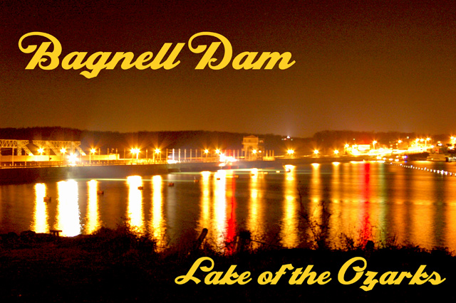
Long night shot, most everything is ugly this time of the year and no snow. I think it has too much grain in it. I should have went with a lower ISO, but most of my ext ep's have been with film. All new stuff now.
Statistics
Place: 252 out of 266 Avg (all users): 4.7333 Avg (commenters): 4.6000 Avg (participants): 4.5818 Avg (non-participants): 4.9000 Views since voting: 937 Views during voting: 320 Votes: 210 Comments: 12 Favorites: 1 (view)
A little grainy in the sky, but not too terribly bad. The design of the card is really quite nice - well balanced and the text fits well without interrupting the picture. I notice a lot of folks thought the lettering was too big, but seems to me a lot of postcards look just like this as far as text, size and where it's placed. I love the two streaks of red - really adds a nice touch. This could be a bit "crisper" if exposed just a little less, maybe. I find with night photography that underexposing is better than overexposing. With this shot, you can make it darker in post but you will emphasize the grain when you do. Try levels and bringing the top of the sky to black then add a bit of sharpening - gives a different look to it.
I agree with what the other commenters said. Try toning it down quite a bit to see what you get. Look at the other shots in this challenge that use lights reflecting on water as models.
The text overwhelms the delicate lights and reflections on the water. I'd like to see less grain, too. The positives for me are the colors (love the reds!) and the way the river curves off towards the right. I find the blown parts of the lights to be a bit overwhelming, and wonder how it might be if the entire image were a bit darker. I do like the way the shore frames the bottom of the image.
Technical: The lights are bothersome when looking at the photo. Too bright, too much of an orange tent. The orange color then saturates more than half of the photo (even areas where there is no light). You don't see much detail of what you are looking at. There also isn't much focus in your subject.
Other: Compared to most of the other photos in this challenge it is of lower quality (but this challenge is also filled with some AMAZING photos). So don't be discourage by a lower score.
I like the yellow hue of the photo from the lights, and like the mixture of light color. The reflection is also very nice. The photo is a bit grainy though.






 Add photograph to your favorites
 Add photographer to your favorites

 Photographer found comment helpful.


