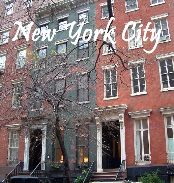
I woulde never buy this as a postcard im so sorry. uniteressting, and dose not show me a side of new york that is injoyable. there for im giving you a 2
This really doesn't show what New York is all about, and the picture itself isn't sharp. Also, the plain white text blends in with the building too much.
There is a lot of potential in this shot, but as it is, it doesn't work for me. The shape isn't right for a post card -- I'd crop the right side to remove that half window at the bottom and bring the gray building more to the center. The tree, the window boxes, and the lamps in the window of the gray building are very nice and could be featured more. The colors are too subdued, and the text is overpowering, but those are easy fix. Also, I'd clone out the cars at the bottom.
Text is very hard to read. Should have put either an outline or dropshadow to bring it out of the background. I like the photo tho. Looks just like Dr. Huxtables house!






 Add photograph to your favorites
 Add photographer to your favorites


 Photographer found comment helpful.


