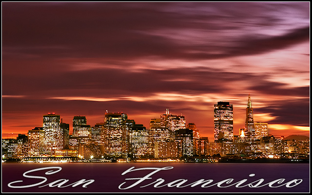
Converted from Raw three times. Once for sky around normal exposure but warmed the sky, Overexposed photo to bring out the water. And underexposed and cooled for the skyline. I used masks to get them even. I used a selective color layer and a gradient map set to Luminosity faded to 50%. Ran through NI once over the whole image. Then ran the water through a guassian blur and faded back and then ran that specific layer through NI. Flattened and resized and ran through Luko USM technique. Created the text and border. The photo was saved at 88% and is alittle sharper then it appears. Feels like a postcard to me :).
Thanks for all the comments, the scores in this challenge were amazing and glad to be in the top ten. Here is my photo larger and with out text. This one is For Sale :)
Statistics
Place: 8 out of 266 Avg (all users): 7.1318 Avg (commenters): 8.5429 Avg (participants): 6.8319 Avg (non-participants): 7.4486 Views since voting: 3567 Views during voting: 359 Votes: 220 Comments: 55 Favorites: 8 (view)
I gave many 10's in this challenge, but this one was my favorite.
It is simply outstanding and makes one speachless. The sky and the colours are tremendous. And so are the lights - there not a gap from left to right.
You should make it available for printing (both with and without the text).
Finally an image fitting of a postcard. It is the 63rd image I have reviewed and the best so far. I think that this should ribbon. I really like the choice of text. Well done!!
lots of good things about this photo. Exposure, composition, font, color, my only gripe is that the buildings look jumbled and undefinable. It's ok though, it's still a great photo. 6
My most favourite city in the world. I hope to go back one day.. this reminds me of it soooo much.. perfect postcard image.. one of the best in challenge.
10
Gorgeous! I love the colors in the sky, the smoothness of the water, the detail in the buildings. The way you rendered the San Francisco text makes it feel like it is resisting the wind that is blowing the clouds across the sky. The serene water and city skyline seem to be a contrast to what appears to be a windy sky, perhaps the remnants of an afternoon storm. A great postcard!!
very, very nice. the colors in the sky are exceptional, and that's the only way this much sky should be allowed (the focus should normally be placed on the cityscape). But it works here very well. starting with a 9.
LOVE the sky, LOVE the cityscape. There's a ton of detail in it. And I love how the foreground is so nice and simple. The water I assume? The one thing I would fix is the text. if you made it a bit smaller it might relieve the tension of the tet being so close to the edges. On the other hand, it is kind of cool that the city is kind of sitting on the words...Enough of my rambling! I'm betting this will be on the top!






 Add photograph to your favorites
 Add photographer to your favorites


 Photographer found comment helpful.


