Yep...Less is more. A beautiful image. My only suggestion is that the text at the bottom is distracting and I think it would have done its job just as well by being in small typeface just under the main heading...Anyway I'm sure you don't really want a desktop publishing critique :) As I said a beautiful and surprisingly evocative image.
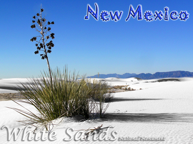
One of my four 10's in this challenge. I love the natural looking colors, the fact that you didn't oversaturate this. Not 100% pleased with the conflicting fonts (but I do like each one), but the photo is lovely.
Nice postcard. The picture is very good, nice colors, details and compostition. The New Mexico text looks good on it because it gives a kind of Mexican feeling to the picture which does not IMHO look very Mexican. Well done and good luck :o)
Lovely photo, and the choice of and color of lettering at the bottom was excellent. I also think the lettering at the top is fun, but I'm not sure I like the mixture with the other typeface at the bottom. Even so, I like the post card. 7
I actually thought about driving down to White Sands to take a photo for this competition. I am glad I didn't because I don't think I could have topped this one. Nice Shot!





 Add photograph to your favorites
 Add photographer to your favorites


 Photographer found comment helpful.


