That's funny that people wanted to change the spelling. i might have considered that the photogrpaher would know best - but I'm not as ethnocentric as some. Anyway, G, this is great - The composition, colors and mood are supurb. I think the black and white type might have looked better with some color but that's my only negative - it's beautiful.
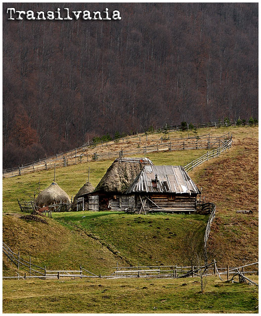
For those how commented on the "misspelling", well it is NOT misspelled in romanian. Not everything is written in English, you know. There are other languages in this wide world. Oh, and if you go buy a postcard in Transilvania, there is like 0% chances you'll find one where is written "Transsylvania" or what-so-ever.
Congrats on your very nice pic, love it and added to my favs.
at first glance it looked like it was raining in this postcard, not a place you would like to go to, but I can see it is full of hills and forest trees a very country feel good luck.
Wonderful image. The hillside and the two strong color tones in this work great together. Very nice work putting this together and in your compositional choices. Text for the postcard is "ok". I like the font style selected - not sure I'm totally sold on the placement and size, but hey, we're not graphic artists now are we? :D Good luck in the challenge.





 Add photograph to your favorites
 Add photographer to your favorites

 Photographer found comment helpful.


