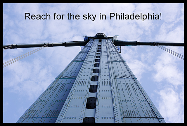
Almost looks personified - like a giant robot guy covered in braille, which is kinda cool. I like the perspective and the way the color of the bridge coordinates so nicely with that lovely soft sky.
I like the angle a lot, but since it's not centered, the centered text makes it look ... disjointed? Centered often isn't as interesting, but it would work well for this symmetrical view, so try to make it really centered.
Also, try a more interesting font.
I missed this in voting, but would've given it a 6. With the changes above, maybe higher. :)





 Add photograph to your favorites
 Add photographer to your favorites

 Photographer found comment helpful.


