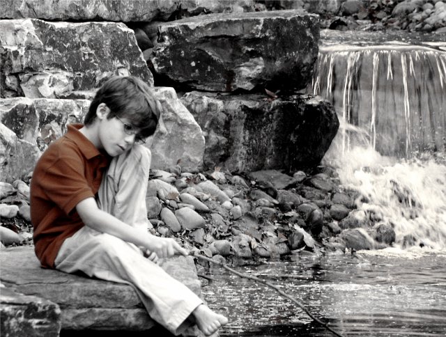
Not the most perfect of entries but there is a good use of the natural light to capture this image. I know I am probably going to get comments about this being for the alone challenge, but no mistake here. Everything just felt right for the lighting to make this interesting.
Statistics
Place: 75 out of 132 Avg (all users): 5.3571 Avg (commenters): 6.5714 Avg (participants): 5.2326 Avg (non-participants): 5.5147 Views since voting: 1158 Votes: 154 Comments: 32 Favorites: 1 (view)
Right, i've deliberately waited until later than usual to write my critiques, to see if it changes anything, and of course it doesn't.
I like the mood of this one Anna - even though the focus seems to have 'missed', and the rocks behind the child seem more in focus than he is. Plenty og good and useful comments too, which is good to see.
I'd like to see what he's doing with the stick, even if it's just waving around in mid-air, especially as the composition really pulls the focus that way - the movement of the eye from falls, to child, to stick is very natural and it's a touch a shame that the end of the stick isn't there. I think focussing fully on the child, and leaving the bacground to blur out with depth of field would add impact, but perhaps would lose some of the tones of the rocks. The selecive colour thing works, as some have said, to bring the eye to the subject, and works well for that: and it's a trick I mostly don't like at all.
I like how the helpful comments don't get marked "helpful" yet this did:
He got glasses! He looks very good with glasses. ~8
"photographer found this comment helpful"
The pic is nice -- kinda has a Huckleberry Finn thing going on - cept for the shirt which I dont really get. Not too much interesting lighting going on - it's pretty even.
I really like this shot a lot, I like the slight soft focus used here on the boy and i think the desturation technique works well here to draw your attention to the subject ( I wonder how it would lok in colour though). The only small adjustment (if possible) would be to leave a little more room on the bottom of the shot, below the foot. kind of leave the impression of the foot dangling over the edge, and the tip of the stick rippling in the water. 9
7. A bit more clarity between head and toe. I personally find the color of the shirt distracting, although it pulls my eye towards the subject. When I look at this photo, I really want to see the rocks and waterfall. With the boy as an observer.
Is this your boy, Anna? He's a good little actor! The composition is very nice here; I love the way he is in a 'third', and the waterfall adds a nice variety of texture and form. I'm not sure what your exclusive saturation is supposed to be doing, though. It certainly brings attention to the boy, but I don't find that it adds much mood or communicates anything. There is also a clarity issue here; the photo looks almost sharp--but not quite. Still, I like the image a lot. Overall, a wonderful mood is build, and the tones of the rocks and water and model are really marvelous; good luck!
The model's pose and expression along with composing the image with him at near the edge with a plethora of tones and textures in the rocks and water in front of him give this photo a mood of solitude, not really loneliness as the title suggests (but maybe that's just me; I like being alone and rarely experience loneliness). I think this is a great photo, although I don't particularly like the colored shirt and would prefer it a little sharper. But I almost wonder if you entered it in the wrong challenge; the lighting here is rather neutral. I'm not saying it "doesn't meet the challenge"; the lighting is certainly appropriate for the image. But it isn't really a key factor either.
This is a nice photo - if it were someone I knew, I'd probably frame it. I like the desaturation and leaving just his shirt color, it really makes him stand out as the subject and I'm not looking at his surroundings as much. I am having some trouble seeing how the lighting is creating the mood tone though - the expression and posture of the boy is what is really creating that for me. Nice work.
This shot would have been perfect for the "All Alone" challenge. The composition is well done, good cropping overall but I'm not sure I like the color in the shirt so much with the rest of the shot black and white. I personally find it distracting and keep finding myself drawn to the shirt. I started at a 4 the first time around but am going to a 7
This would have been good for the "alone" challenge too, actually it would probably have done better there than here. Personally I like this a lot. The desaturation effect is fitting and the composition is good, maybe except for cropping a little too tightly to the boy's foot. I would have left just a tad more breathing space there. (7)
I really like this picture. I wish It was in a different challenge. I don't see an emphasis on lighting, but I'm not going to take you down for that. Good work.
This is a great photo. The background is beautiful, well focused. The boy is in a nice pose, he looks rather lonely, I like the b&w choice and leaving the shirt colored gives just the right amount of color pop. I'm finding a bit of soft focus on the child though, who I think should be completely in focus since he is a major part of the scene. A thoroughly lovely photo. All that said, with the lighting looking pretty evenly distributed, I don't know how much of it is really affecting the mood (as mentioned in challenge details), most of the mood seems to be from the posing of the boy. When I first saw this I wasn't sure if it was put in the right challenge, but I'm going to guess it was submitted on purpose. I knocked off a point because though the lighting works well in the photo I didn't see how it created the mood, I think its a fantastic image though. 9
This photo should be DQ'd immediately! It's obviously impossible to achieve this effect legally! Just kidding... calm down... I just thought it would be fun to ruffle your feathers based on what I was reading in the forums :)
Nice subject, a very intimate moment to be sure. I notice that the focus is on the rocks instead of the boy, was that your intention in this image? Also, the lighting appears to be a bit flat and uninteresting (to me at least). If not for the focus, this would be a great image to have framed for a grandparent.
I think your camera missed the focus point on this one. The boy is a bit soft while the rocks in the background are in focus. You can overcome that by prefocusing with your subject in the center of the frame, then recompose the shot before pressing the button the rest of the way. I'm struggling to understand the reasoning for the selective color in this photo. It does help, somewhat, draw my attention to the boy, because the overall scene has a lot of high contrast.
Focus could be a little crisper on the boy, unless that was the intention, but otherwise I absolutely love this. Would have been perfect for the "Alone" challenge as well :) The colour left in the shirt is a nice touch.





 Add photograph to your favorites
 Add photographer to your favorites

 Photographer found comment helpful.


