Umm not one of the more interesting Yorkshire scenes... I don't feel this really works as a postcard - too much 'negative space' and the font style,size and positioning doesn't do much to enhance it.
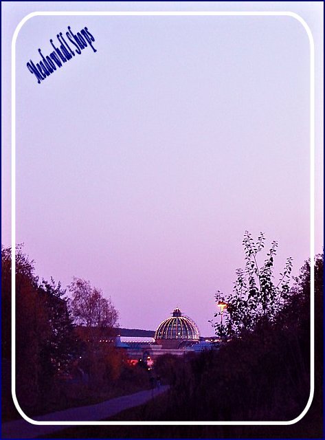
For my taste, this is a bit too grainy. Also, although I love the composition - it's very nice with the negative space - I have to say I'm not crazy about the frame. The text is difficult for me to read. Again, I do like the compostion, so nice job on that! The dome is quite interesting.
Nice coloration! However, the smaller size on the font seems uncomfortably small (to me) given the large amount of negative space...maybe just personal preference. :)
I think you have too much negative space at the top of your photo. And then the border cuts off even more of the subject you do have htere. A little more depth of field would have also helped.
A bit too much negative space for my tastes... the shopping center seems to get lost in the shrubbery at the bottom. The text is also difficult to read on this one. I think perhaps a bit tighter crop on the building with a slightly bigger font would work just a bit better for this one.
Nice photograph with pretty colors, but I can't read the font well and I think the empty top space could better be used for the wording. The border is also a bit distracting.
I'm not voting on text, but I'd never have gotten Meadowhall out of what's on the card -- I couldn't make it out. Nice evening sky and lights on the dome.
That's a unique framing you've used there. Interesting, and in this case adds to the image. As for the photo itself, I think it's a bit thin on subject matter to sell people on the shopping centre. Tough subject to shoot it looks like from a distance - perhaps a little closer in to showcase the lighting on the facility itself? Anyway, good luck in the challenge.
I like your creative use of border, but I can't read the text very well. I like the framing of the centre between the trees, but the image is a bit dark.






 Add photograph to your favorites
 Add photographer to your favorites


 Photographer found comment helpful.


