------------------------------------
After Challenge
------------------------------------
Thank you all for the very very kind comments! Didn't expect this on my 4th challenge entry, or even better said, after having started with photography 3 months ago...
I thoroughly appreciate the constructive crit received from stdavidson, learn so much just from reflecting on a single picture!
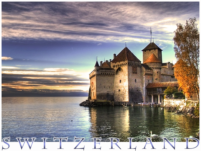
I took this shot on the other end of Switzerland, en route to an event. I knew it would make for a great postcard so I decided to pass by and take some shots while the sun was on its way out. I purposefully underexposed my image slightly in order to prevent any errors from happening in the HDR stage. Original:
If you'd like to see more HDR work with before & after, feel free to check out my entry for the HDR challenge which you can see below:
Again, many thanks for all the feedback !
------------------------------------
Before Challenge
------------------------------------
So here it is, a postcard scene of Switzerland. I was on the way to another event so I snapped a few shots as the sun was fading. Was careful to have no area over exposed in order to avoid any issues later on with HDR.
So once on my PC, I picked my fav shot and performed the following:
- Tone Mapping @ 50%
- Rotate to align horizon
- Brightness / Curves
- Dodge parts of water
- Color Balance / Selective (de)saturation
- Darken sky
- Border / Test / Save for web.
Some people may not be fond of the amount of processing that went in this piece, but it is a postcard and is meant to wow your audience or whoever you decide to send it to if you buy one. You wouldn't want other people to think that you visited some lame location ;)
Anyway, I congratulate the Iceland winners in advance :P Hoping for a 7!
Cheers
Statistics
Place: 4 out of 266 Avg (all users): 7.7557 Avg (commenters): 8.7692 Avg (participants): 7.6404 Avg (non-participants): 7.8785 Views since voting: 9834 Views during voting: 528 Votes: 221 Comments: 64 Favorites: 27 (view)
Not that your score was lacking but I bet those hot spots kept this from scoring over an 8. Since the original didn't have that problem you could have used a mask with a low opacity brush and "undo" the tone mapping a little bit in those hot spots or use the clone brush. Anyway, not that you need the help with this great result.
Thanks for the comment on my Postcard entry, yours is very well deserving of your great score. Beautiful capture and the text you added was a great choice :) Keep up the great work
Gorgeous photo - makes for a lovely postcard. 9
Edit Just been through all the postcards for a final review, and bumped up to 10.Am I right in thinking that there is very subtle use of HDR here? The exposure is absoltely spot on, either way. Lovely work.
Fantastic architecture, great capture, colors, reflection, sky. I think that the title could be better, maybe script in the upper or lower left, leaving the waterfowl unobstructed. Also consider tweaking the verticals. Love it anyways, and hope that it does well.
In the words of the great Strong Bad, HOLY CRAP!
This is gorgeous! Great color and detail all around! I love the way you laid the text on it, too. Beautiful sky, perfect water, fascinating castle, all composed masterfully in the frame. What can I say, this is perfect.
Beautiful scene and photograph, a perfect example of a postcard photo. Very nice job of adding text to this, it doesn't overwhelm the photo like so many of the other entries. Very nice, 10!
Is this the Chateau de Chillon? Looks like it...I was there a few years ago, but long before I got into photography so none of my shots are even close to this good. Very romantic period/fairy tale feel to the whole shot.
Oh, I remember this place well! Chateau de Chillon, Montreux? On the shores of Lac Leman? I lived in Geneva from 1957-1961, and spent one summer at a camp in the hills above this structure. Very nicely done, except the greenish/cyan tint in the mid-sky bugs me.
This image will be a top scorer in this challenge. It is an excellent composition.
The strength of the composition, no surprise, is the lighting on the castle and its reflection. The way you have worked it is superb. The lighting of the trees and dodging and burning of the clouds also adds lighting interest. Your framing of the setting adds greatly as well.
The image has an certain photographic irreverence about it with the way you have totally unbalanced it to the right side of the frame. Perhaps you are thinking of the water and cloud to the left like negative space or what is called white space in print journalism. It is not and therein lies its irreverence. Teachers have a built-in bias for photographic balance. I could just hear them now scolding you for such a horrible error. Great job!
That being said, I'd still crop some off the left side. :)
There is an aspect of the image that DPC voters are amazingly tolerant of, but that I feel is a fault that should be corrected every time. That is overexposed areas in the sky. It has overexposed places to the immediate left of the castle and to the upper left of the trees.
I'd correct those if it were me. I assume you've brought out all the detail there is to bring out in those areas, so I would do it with light cloning. In that technique I would select an area of sky with indistinctive detail but similar to what it should be and lightly clone it in using a brush of low opacity, below 20%. In this way you can slowly airbrush detail into the overexposed areas until it is just right. If you try this I suspect you will be amazed at how natural and unlike the area it is cloned from that it actually actually turns out to be.
I'm unsure that splitting the word 'Switzerland' in half using the border at the bottom is a good idea. It looks nice after you look at it for a while, but at first glance it is hard to read and that is generally not a good thing in a postcard, though you see this style in postcards often. At DPC voters, like me, generally to make an instantaneous value judgment of an image and you may be faulted slightly for readability.






 Add photograph to your favorites
 Add photographer to your favorites


 Photographer found comment helpful.


