Author Thread Comments Made During the Challenge
Post actions
Post actions
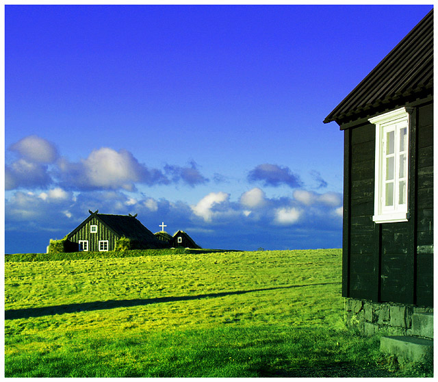
The degree of saturation has even given the windowframe shadows and the foundation a level of green that I don't imagine they should have.
Post actions
It looks a tad over saturated, but what an awesome place that must be.
Post actions
The green is way distracting.
Post actions
Árbær? Great colors and composition. I would have been sorely tempted to edit out that shadow coming in from the left, but I suppose that's against the rules.
Post actions
Aspect is a little off for a traditional postcard, but picture is awesome.
Post actions
I'm guessing it's Iceland.
Post actions
Lovely shot, not a good format for a postcard.
Post actions
The green is too green IMHO. But overall a nice scandinavian countryshot, nicely composed, with good contrast.
Post actions
The greens seem to be a bit over saturated in this.
Post actions
Post actions
I love the composition, but the colors are a little too saturated. Great Picture!
Post actions
The colors really jump out here, I can see this being a postcard. Interesting composition and an overall great shot.
Post actions
Much too over-saturated for my tastes - the stone at the base of the near building has taken on a strong green tinge. A shame, because you have a good composition here.
Post actions
I love the perspective but the colors look too tweaked to me. Green is really bright.
Post actions
Post actions
pumped up the green a little too much. the rocks and steps on this foreground building look way off color-wise
Post actions
Post actions
i love the colors but feel like it needs some words to explain
Post actions
Far too oversaturated in my opinion. Score: 4.
Post actions
Ouch... my eyes hurt :)
Post actions
Post actions
Text could have added to this image. Its a great picture but its size (relatively square) work against it as a postcard. This also looks oversaturated.







 Add photograph to your favorites
 Add photographer to your favorites


 Photographer found comment helpful.


