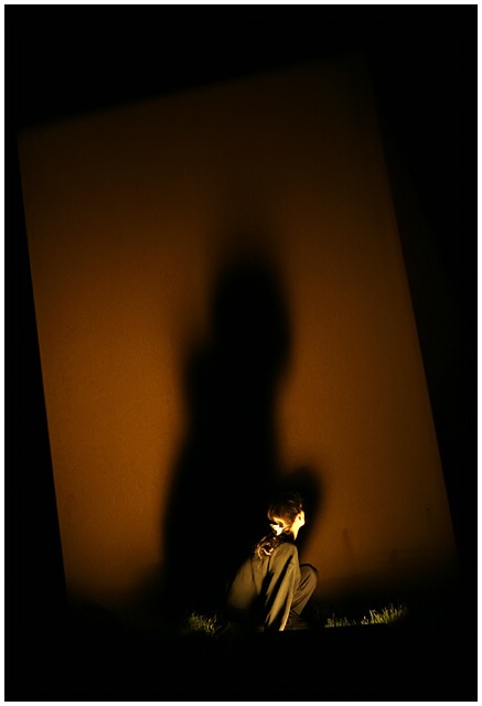
Nicely done. I like the limited colour palette and low light very much. I feel it could do with a very slight crop at the left or a touch more space on the right, but that's minimal and based on "instinctive feeling" not anything concrete about composition "rules".
Though I do think that shadows and light are separated by the thinnest line imaginable, your title brings me to the conclusion that the focus is on the shadow, not the lighting (I could be wrong). I like the concept over all, the lighting is good for getting what you were going for, but because the shadow is central, I'd prefer it to either be a recognizable shape, or have an inherent oddity to it that grabs the attention. This didn't work for me, but I've tried capturing shadows and it was dang hard so I gave a 6 for the fine effort and vision.
Are you in the wrong Challange? Just kidding.:)) Love it. The tall size makes the image look larger than it is with the shadow moving upwards. I like all that space above, the rectangular shape off at a slight angle. 10!
Wow! Great picture! Off topic aside: Did you read CHoke by the guy who wrote Fight Club? Weird book but there is a scene in there which describes how some tribe of native americans would trace the cast shadow of a boy to get an image of what he would look like as a grown man.





 Add photograph to your favorites
 Add photographer to your favorites

 Photographer found comment helpful.


