Author Thread Comments Made During the Challenge
Post actions
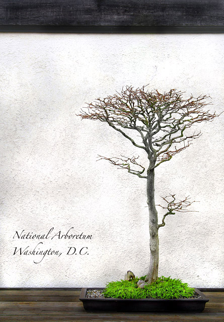
I like the in-frame framing. Lovely composition, good integration of text. 9
Post actions
Post actions
Very nice, very artistic. What's that thing at the top, though? Try it cropped to just a bit above the tree.
Post actions
I may have chopped off the top, does not add much.
Post actions
Perfect. Absolutely perfect. Sell this to them.
Post actions
Beautiful Bonsai....Nice picture..
Post actions
Nice idea and execution. Cropping of the black at the top would be better.
Post actions
the wood across the top is a little distracting to me. My eyes want to see it level to frame the shot, but I think it's a little bit slanted. (maybe it's my eyes... i keep looking at it hoping to see it level off! Otherwise this is a very nice shot
Post actions
Elegant design, good job. And the beauty of the photo is the starkness of the light image and the POP of the green.
Post actions
wonderful photo and great use of a classy font to fit the tree branches
Post actions
One of my favorite postcards. Nicely executed on all levels.
Post actions
Nicely composed. Classy and under-stated. 9.
Post actions
i like it better with the top piece of wood cropped out, tighter to the top of the bonsai tree. i especially like the textures in the background (wall) very well done. different from all the night shots.
Post actions
I really like it. I'm just not sure whether cropping out the top piece of wood would hurt it or help it.
Post actions
Post actions
This is very nice. Simple, well composed. Sends a simple message and is interesting to look at by itself (as a standalone photo). The font style you've selected is classy and fits the theme. Well done. Good luck in the challenge.
Post actions
Very cool picture, although I would have cropped out the dark ceiling. Nicely done.
Post actions
Although I would have cropped the black area from the top, this is a really creative way to show DC and lovely white balance. 7.
Post actions
I think this would have been better had you cropped the black off the top. (A border could have brought the dimensions back to postcard size.) 5 (cropped I would probably give a 7 or 8)
Post actions
very nice. I like the minimalist quality. 7 for now
Post actions
The horizontal stripe at the top is distracting in my opinion, but I really like the shot and the bright green of the moss/grass. Score: 7.
Post actions
Very cool and creative...It's like an optical illusion...wow.
Post actions
wow, that is such a cool image, postcard or not. 10





 Add photograph to your favorites
 Add photographer to your favorites


 Photographer found comment helpful.


