|
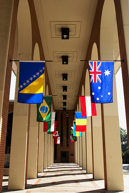
4 - Don't mind the concept but think a straightening and much tighter crop on each side to eliminate the distracting background elements, likely make this better in my opinion. The colors / flags combined with the architecture style and color, make this seem to border on 'clashing'/busy too, but again, eliminating the background/sides and trying to 'use' the unusual combinations, may have worked. Otherwise, maybe a toning/b&w - who knows. |







 Add photograph to your favorites
 Add photographer to your favorites


 Photographer found comment helpful.
