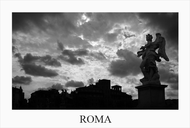
8 - Nice and clean. Even though you cannot see too much of Rome, it (image+framing+text=postcard) has good character and a good depiction. Toning works well. As mentioned, perhaps a little more detail in the buildings/architecture, however you would likely lose that very good and unusual sky.
bring out the detail in that statue in the foreground and I'll give you a ten - great composition and I love the classic framing and font choice. But my eye is drawn to the sun instead of anything "roma".
I like that there is more detail in the statue, so I don't get distracted to the buildings in the backround, which seem not as elegant as the statue. A little more detail in the statue might have been nice, though I'm sure that would have been hard since the sky is exposed very well. 8





 Add photograph to your favorites
 Add photographer to your favorites


 Photographer found comment helpful.


