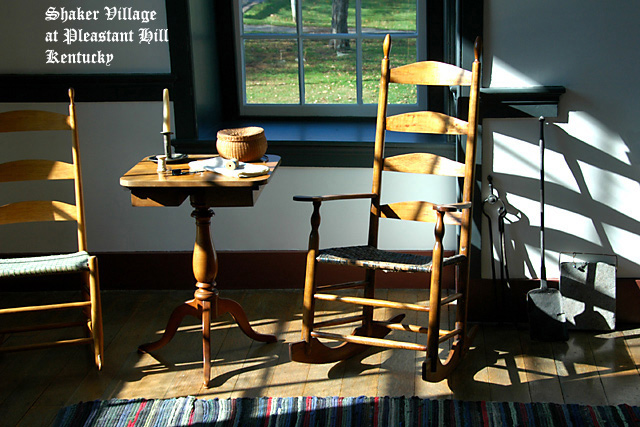
A good scene for a museum postcard, plenty of interest without too much detail. I'm not too sure about the chair that is not quite in the frame - makes the composition slightly unbalanced. I definitely don't care for the font - a postcard of a Shaker home would, to me, need a much simpler style, and whilst on the subject ot text, oops - bet you are kicking yourself now ;¬(
This has a nice postcard feel to it. Clean, crisp, and interesting to look at. The strong lighting works overall, it does seem a little hot on the right rocking chair perhaps, but that's a minor issue in the big scheme of things here. :D I do get the impression you were timid on placing text on this nice photo? Personally, I would have maybe gone a little larger on the text (I like the font style BTW), and spread it out some, maybe even split the message into two parts; "Shaker Village" and then "Pleasant Hill, Kentucky". Something like that. All JMO of course. Overall, nicely done. Good luck in the challenge.







 Add photograph to your favorites
 Add photographer to your favorites


 Photographer found comment helpful.


