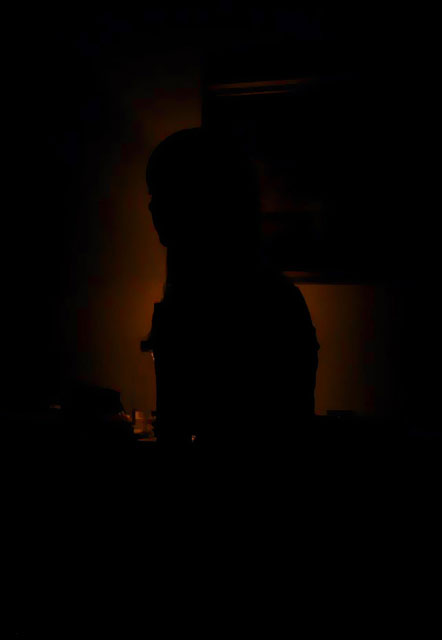
I like the idea behind this image, as evidenced by the title, but I think it needs to be lightened up just a bit because the image is practically indistinguishable. That may be what you were looking for artistically, but I can't determine who or what is alone in the shadows and that really affects my interest in the image. I think with a little bit more light you could still have the shadow affect, while letting in more detail for the viewer. 3
"too dark"
Just kidding. It works nicely here, though I'd like to see more of a profile on the subject so it's more obviously a person. What's that blue/red halo? 7
This is the first photo I have seen in this challenge that's too dark. I've been thru about 1/2 of them. I like how the background colors have a rich, old time feel.
Nice concept, but the silhouette is lost in the picture on the wall. A little too much black for my liking as well. Brighten the "aura" a little and move the picture and it's a great shot!
I can tell there is supposed to be something in this shot by the slight color I'm seeing toward the middle, but there is not enough there for me to be able to judge what it is. At least not on this monitor.






 Add photograph to your favorites
 Add photographer to your favorites


 Photographer found comment helpful.


