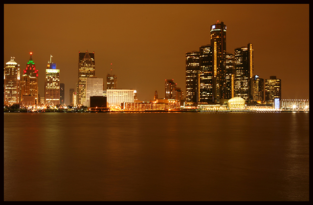
All of that negative space in the water is just screaming for some text! I'm not sure I like the horizon right through the center, but with text added at the bottom, it might work.
The refections are a bit too weak to make this work IMHO, with just a boring area of brown at the bottom. The building to the left also looks a bit chopped off, so the composition isn't spot on in that respect either. On the good side, it's nicely exposed with no burn outs, so good job there!
A pano would have been gorgeous here. I don't think you could have done that within the rules, unless you did some serious cropping. As is, there is just a little too much water. But I certainly like the colors. You should have taken advantage of the special rule, and added some text to let us know what city this is.
A cool cityscape! I might have added text in the water area since text is allowed in this challenge. As it is, it seems like the shot is a little too evenly divided in half. I probably would have cropped it so that there was less water and more sky, or fill the water with appropriate text.





 Add photograph to your favorites
 Add photographer to your favorites


