You left out
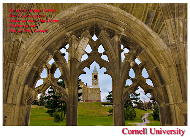
"Lift the chorus, speed it onward, loud her praises tell ..."
Cornell '88 :)
So - is this Zeke Smith?
It's a nice composition, but a little low contrast. More importantly, the lengthy text piece is very hard to read because of the red color, the drop shadow, the italics, and the placement. Straight white would work better.
i think the red rhymes in the corner are a bit distracting, at least the colour. but i do love the white line with red title, and the photo itself is perfect for postcard.
Beautiful shot - composition, color, focus. The red text in the upper left is too hard to read. That could be fixed by playing with the color and font style. (Italics are always harder to read.)






 Add photograph to your favorites
 Add photographer to your favorites


 Photographer found comment helpful.


