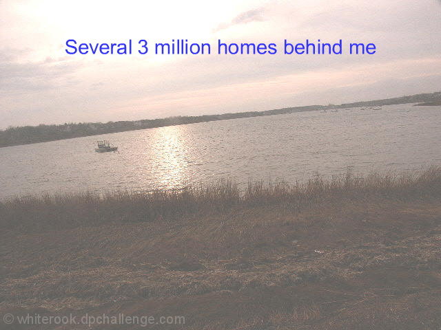
I like how the photo is not level. Excellent post processing with the text added to the photo. Only suggestion, use brown text instead of blue to "match" the color of the grass in the foreground.
I like how the photo is not level. Excellent post processing with the text added to the photo. Only suggestion, use brown text instead of blue to "match" the color of the grass in the foreground.
I really try not to be negative in my comments at all.. But, a snapshot like this really does not need to be here. I feel as if you were just trying to enter something, just to enter. Next time please try harder.
I am sure you have already been told that the horrizon is leaning!
I can see what you were trying with this shot but i'm not sure that the muted colours work.
Good luck anyway
Sorry, but this picture is too grainy, lacking in contrast, and focus. Are the homes behind the lake or flooded out, I can't tell what you are trying to say. I can't see the homes.
ok, you have probably heard this already but here goes..
looks foggy, upping the contrast would help here. The image is wonky. The text is awful.. unless you are intentionally going for the brown ribbon here then I am afraid to say this will score quite poorly..
Well, I'm not sure what you were going for here, but the tilted horizon, foggy effect and weak use of text aren't coming together well for me, I'm afraid.
I'm not sure I get this one... photographically, the shot is unappealing and seems hazy with a tilted horizon. As far as the postcard part of the challenge, I don't get the added text, and the font and color choices don't seem to go well with the postcard. Even a few simple fixes like a levels adjustment, rotation and a different font could have been very helpful for this shot.
I can tell you from past experience that the horizon police are going to be after you. It's definetely tilted way up towards the right. The photo is also pretty cloudy. I don't know if that is an effect or not, but you can't see any detail in the p hoto and barely any color. Your text takes away from the photo as well...."Several 3 million homes behind me"? Did you mean Several $3 Million homes behind me or 3 million homes behind me.
It's kind of washed out, a bit of levels or curves or brightness/contrast adjustment might help, but it has lost almost all detail. I think that the text is not necessarily--IMO--appropriate for a postcard.
I HOPE you are going for the brown ribbon. Should I list my concerns or have you been very mindful in your inclusion of photographic flaux-pas already? I'll be redundant just in case - tilted horizon, no dicernable color, yet not black and white, no tonal range, no subject or focal interest, bad focus, odd text in jarring blue that makes little sense... are there 3, 6, 9 million homes behine you or are there 3 million dollar homes behind you... and are you laughing at the people who shelled out that kind of money just for this view?
horizon is tilted to the left, severely .... colors are very washed out ... no contrast ... photo is grainy ... caption doesn't make any sense ... sorry







 Add photograph to your favorites
 Add photographer to your favorites


 Photographer found comment helpful.


