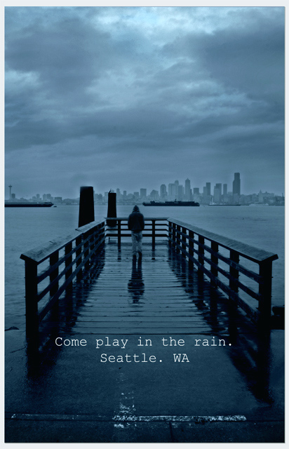
It was pouring down rain but was fun to shoot. No this isn't your typical postcard setup, but those have gotten boring.
Editing included Shadows/Highlights, Dodge/Burn, Crop, Moonlight Filter to change color cast to blues, add border, minor clone for water spots AND Unsharp Mask.
Statistics
Place: 80 out of 266 Avg (all users): 6.0917 Avg (commenters): 6.9000 Avg (participants): 6.0536 Avg (non-participants): 6.1321 Views since voting: 1139 Views during voting: 366 Votes: 218 Comments: 21 Favorites: 3 (view)
Yay! Somebody else used Courier. You see, there used to be this thing called a typewriter, and gritty cities like Seattle had, like, writers and, like, journalists, and stuff, and so a typewriter font conveys grittiness... I feel your pain. 9
My pick in this challenge. This would make an awesome poster/print (and it might find a home in my office). Terrific lighting/mood. Normally the barges ruin the shots from Alkai... but they actually HELP in this scene. Well done!
Nicely reinforces the Seattle reputation. You could find a better font. And I'd place it where it didn't block the entrance to the dock. Actually it blocks the entrance to the whole photo.
This is a nice shot, I like the way the pier leads out with the skyline in the background. The blue tones are nice too, and help give the feel of a dreary day. Unfortunately, I would have rather seen this in something like a "rain" challenge. It just seems so sad and depressing, and makes me want to stay away from Seattle. The text also seems just thrown on. I think I might have liked to see it lower to the bottom of the postcard, and a different font.
I love this idea, but I think the horizontal band of light reflecting at the bottom is distracting. Maybe crop a bit higher and bring down the words a bit?





 Add photograph to your favorites
 Add photographer to your favorites

 Photographer found comment helpful.


