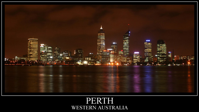
Pretty simple i suppose. levels, curves, added frame and USM.
I really wanted to take part in this challange but couldn\'t think of anything more creative so I\'m prepered to hear any criticism. Hope to get heaps of tips and learn from all your comments:) I know, it\'s not very sharp but thats the best my kit lens could do:( Still saving up to get a decent one:)
Statistics
Place: 74 out of 266 Avg (all users): 6.1455 Avg (commenters): 7.0000 Avg (participants): 5.8785 Avg (non-participants): 6.3982 Views since voting: 1847 Views during voting: 438 Votes: 220 Comments: 16 Favorites: 0
I'll briefly talk about the technical stuff, since, based on your own comments and those you got during the challenge, you know the major problem is with sharpness.
I love the sky in this shot, too many people, when doing a cityscape like this make the sky black and the edges of the buildings get lost. Here, the overcast sky and the city's glow combine to give a surreal orange look to the sky.
From an aesthetic point of view, my eye is immediately drawn to the right half of the image, due to the pink and purple reflections on the water there and the fact that the reflections are more intense on the right side. The left half just isn't as interesting to me. If anything, you might try cropping most of the right half entirely.
The only other thing I might suggest would be to try HDR or something to expand your contrast range and keep the lights on the buildings from being blown out. It's just something to consider trying.
WOW!!!!
I can't believe this photo did so well:) thank you all for your comments and suggestions. This is my very first chellange result. I seriously didnt expect this photo would end up in the first top 100:)
I'm pumped, inspired and wanting to learn more:)
Australia day 1998 I saw the best fireworks show in my life from the view in this photo (or close by). This is an awesome capture. I love the pink and blue reflection on the right. Nothing seems too blown out to me and the focus looks good. I might have put the wording all on the same line instead of two lines so that there isn't so much black space on each side but it also works the way it is. It isn't distracting or anything. Overall I like this photo. 8 for now but my first vote in this challenge. I may bump it up.






 Add photograph to your favorites
 Add photographer to your favorites


