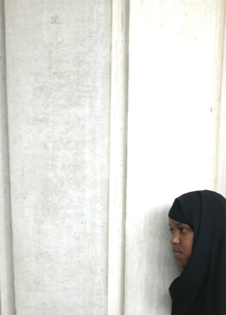
Challenge:All Alone (Classic Editing) Camera:Nikon Coolpix 4300 Location: Adelaide, Australia Date: Oct 18, 2003 Aperture: f/4.9 ISO: Auto Shutter: 1/38.4sec Date Uploaded: Oct 18, 2003
Nice contrasts in this image. I do think the white is a bit harsh - I'd like it better if it was a little toned down. That said, it really sets off the subject, both her skin tone and the black burqua?. I like the long look of the photo, but would prefer it cropped a little, I think it would still hold its length well. Good composition, the girl looks alone and has a sadness to her that I can easily equate with isolation and solitude. Nice job. 7
The positioning of the subject doesn't really work for me. There is just too much empty space in the photo. Clearly that was your intent so maybe it's just over my head. (no pun intended)
This is a very powerful image, both in its visual impact and with the title you have given it. Lovely face, and the only suggestion I might have would be to crop a bit off the top...9
Good use of negative space, I like this picture for its simplicity. Only two elements I would have improved, the blow out of the upper right corner and the indented line of the architecture on the left. I think I would have cropped proportionately from the top and left side to avoid the angled indentation – while still maintaining as much negative space and the proportions of the picture as possible.





 Add photograph to your favorites
 Add photographer to your favorites


 Photographer found comment helpful.


