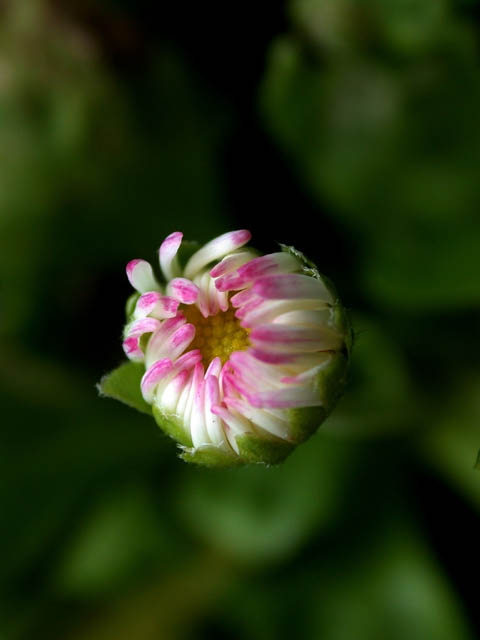
I read in a tutorial that if you can't get it centered exactly, to not center it, but to use the rule of thirds. I think that may make this more visually interesting. The clarity is great, and I like how it stands out from the background. Some people are probably going to say it's too "OOF" in the background but I personally like it exactly how it is. The title is very orriginal, I like it. A lot better than "New flower" lol. I wonder if it were open just a little bit more, if it may have a bit more color, in contrast to all the green. Great job with your photo. Good luck with the challenge.
Nice catch! Details are so clear! Not certain how much I like the large open space around the edges, but I call that personal choice. How about a 9? Swash
I find the background a bit overpowering, perhaps a tighter crop would help, The image looks a little to soft as well, but overall this was my pick as a winner. sulamk






 Add photograph to your favorites
 Add photographer to your favorites


