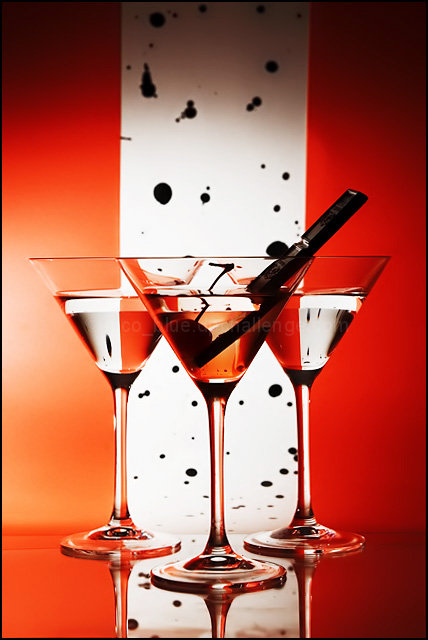
Originally I was going to buy a roll of spotted paper but couldnt find any for the life of me so plan B was some black india ink spashes on a white poster paper. I tried a minimalist composition of just a single glass against the black spots but the glass wasnt showing up bcos of the whiteness. So I had the idea of framing a white spotted stripe with some red on each side, and also add two more glasses. I was thinking about doing a splash somewhere along the line but decided this would be enough for now.
Inspired by the millions of wine glass shots that came before :-)
Statistics
Place: 15 out of 175 Avg (all users): 6.4213 Avg (commenters): 7.2667 Avg (participants): 6.4000 Avg (non-participants): 6.4286 Views since voting: 1480 Views during voting: 408 Votes: 254 Comments: 19 Favorites: 7 (view)
Ah, so that was yours. Although it is a bit of a cliche subject-wise around here, I thought that your execution was far richer and more relaxed than any of the other renditions I've seen. I think it was the relaxed style in it which attracts.
Very nice picture that is similiar to some tutorials on this site. Very nicely done, but originality is a big part of scoring for me. I love the use of lighting, color, and the overall look of this image. If I hadn't seen the concept before I'd give it a top score.
Your white stripe tilts to the right a bit. It also looks like it's separating from the background? It looks like there's a shadow on the top left of the white paper. With that all said, I doubt anyone will notice! Nice job.
Nice job!! the reflection is great and you background is also nice. I would have left the black prop in the glass out it takes away too much, pulling the focus to it instead JMO.
Clever idea! Probably could have done without whatever that black object is in the drink. Something also doesn't quite line up with the backdrop (white) material - it's making the photo appear to lean to the right. Nonetheless, you should do well with this. Good luck.






 Add photograph to your favorites
 Add photographer to your favorites

 Photographer found comment helpful.


