Critique Club Review:
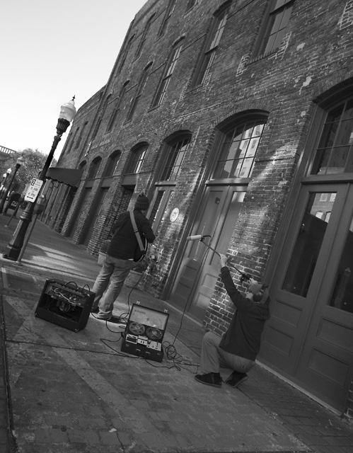
Technical: Focus and depth of field are excellent. Brightness and contrast are done well. Color, saturation & hue: N/A
Reaction: Interesting angle but I'm left unsure as to why it was done this way. There are no visual clues, or anything in the title, would give a reason. You don't necessarily need a reason, but it usually helps. I would have preferred seeing the subjects from the front. The backs of heads is what you usually get from quickie snap shots. I do like the play of light on the wall. Had the subject posed there, and faced the camera, there could have been a nice album cover out of this. I also think this picture is one that works best in B&W. Had this been done in color, there would have been too many distractions. |






 Add photograph to your favorites
 Add photographer to your favorites


 Photographer found comment helpful.

