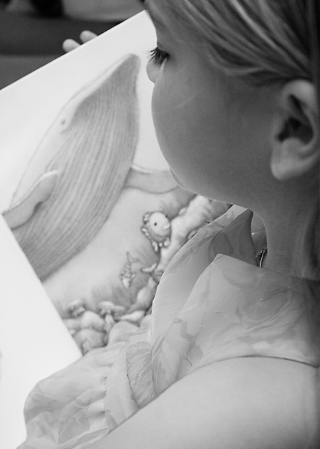
I used two exposures for this photo; one for her and the surroundings and one for the dress. The dress was too exposed at the same level as the rest of the photo and I wanted the patterns to be more visible to make the overall photo less 'bland'.
Other than that there was a little burn / dodge work to make the two exposures blend together, curves adjustment, and unsharp mask to finish it off.
Not sure how this one is going to do... I dont think it is the best I can do but it is in the short time I had to do it in.
Statistics
Place: 372 out of 424 Avg (all users): 4.8844 Avg (commenters): 6.0000 Avg (participants): 4.8860 Avg (non-participants): 4.8814 Views since voting: 962 Views during voting: 266 Votes: 173 Comments: 4 Favorites: 0
Nice idea but needs more contrast, the lighting seems a little flat so maybe if you darkened the shadows and lightened the highlights it would have more contrast and more depth.
You're lucky. I'll send mine around for some calming down as well! I like the way the child appears part of the book scene by virtue of the similar shading. I think the view straight down her ear seems not quite right, but her eyelash is gorgeous.7





 Add photograph to your favorites
 Add photographer to your favorites


 Photographer found comment helpful.


