|
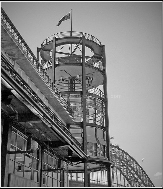
Nice interesting compostion, I really like the use of space and lines, the way you have filled part of the frame with the building and left the space on the right is very nice. The contrast between the sky and the building is also very appealing. For me what I would have like to have seen would have been more highlights and shadow in the building itself, more pure whites to make the picture pop and more shadows to make the different shapes more defined and interesting. Overall I really like the picture just think it could have been more dramatic with more work on highlights and shadows. |







 Add photograph to your favorites
 Add photographer to your favorites

 Photographer found comment helpful.


