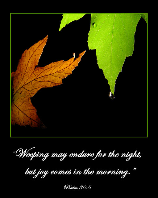
Beautiful poster!
I think the Bible verse is just right!
I also like the thinner green line you used in the border. Maybe even the (black) border could be thinner too, but that's not an issue at all.
This font is much better. I would make 1 point smaller, though, and/or not use bold - I think it will make the whole poster "lighter" and more balanced, by driving the viewer's attention a little bit more on the image.
These are just my personal observations, which I don't consider indispensible.
This is a fine work of yours just as is. Congratulations!
|




 Add photograph to your favorites
 Add photographer to your favorites

 Photographer found comment helpful.


