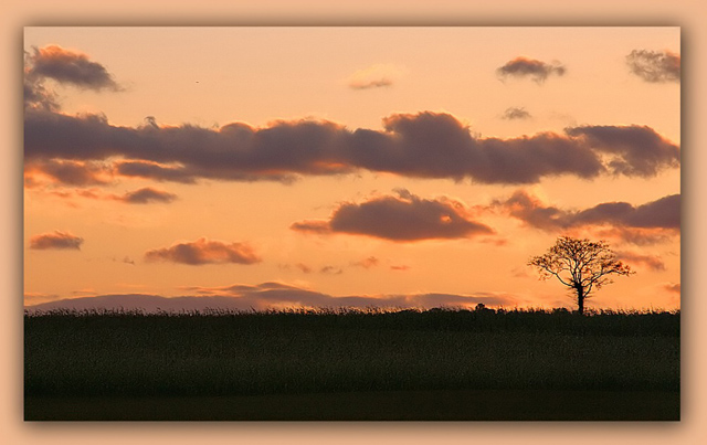
I'm sorry, I usually try to ignore the more imposing borders, but this one, for me, distracts hugely from the image: and it IS part of your submission. I think the use of a colour from the image weakens the impact of those colours IN the image enormously.
I like this one very much, one of my favorites. The only thing that bothers me every single tima I look at her is the border. No border was needed for this one. 10 minus the border = 9
Fantastic image. The colors are great, I love silhouettes. Excellent lighting and the composition is perfect for the feeling of solitude/all alone. There seems to be a bit of softness near the tree - doesn't have a completely sharp line, but perhaps that's from resizing? Great shot, both as a challenge submission and stand alone. 10
Great colours I love the simplicity of this image. The border I actually think takes away from the overall effect, but that's just my personal preference.
The photo is awesome! The title is "so so" and the border is basically lowering the quality of your image. This would have been way better without that distracting border there. Without the frame (10) with the frame (8).
Great photo, lovely colours, effective composition. Score without border: Probably 9
Score with very obtrusive, unnecessary border: 6
Sorry, but the border really ruins the shot. I can barely concentrate on the photo.
I love this photo. The border is very clever, but I think it also distracts from an amazing photo and might have been better with a plain border to draw the focus to the tree.
good atmospheric element. My only suggestion is to up the contrast a bit to make it more of a silhouette - but that's just a personal opinion. nice work.





 Add photograph to your favorites
 Add photographer to your favorites


 Photographer found comment helpful.


