| Author | Thread |
|
|
12/08/2006 09:21:23 AM |
|
You got an 8 from me and I certainly like the photo a lot. Would be proud to have this in my portfolio. |
|
 Photographer found comment helpful. Photographer found comment helpful. |
|
|
12/08/2006 03:43:28 AM |
|
| Photographer found comment helpful. |
|
|
12/08/2006 02:40:51 AM |
|
I love it Tim, and I hope to see a lot more of these type of images, in your portfolio please..... It almost looks like a painting..... |
|
| Photographer found comment helpful. |
|
|
12/08/2006 01:24:51 AM |
|
Nice job, Tim! The title fits perfectly. |
|
| Photographer found comment helpful. |
|
|
12/08/2006 12:29:40 AM |
|
| Photographer found comment helpful. |
|
|
12/08/2006 12:20:56 AM |
|
What a rip off. I look at the top 10 and this is 107??? COME ON. Love it, Tim. Seriously, a great image. |
|
| Photographer found comment helpful. |
Comments Made During the Challenge  |
|
|
12/07/2006 07:14:07 PM |
|
This is just awesome..... |
|
| Photographer found comment helpful. |
|
|
12/07/2006 10:11:56 AM |
|
This evokes Burton well. 8 |
|
| Photographer found comment helpful. |
|
|
12/06/2006 01:58:22 PM |
|
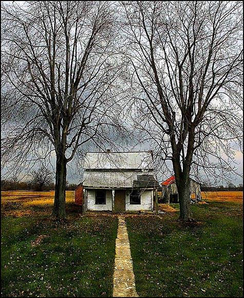
Nice title, but you're missing an apostrophe. Don't you hate when people leave comments like this? I do very much like the dead-center composition. May be just a *wee* bit oversharpened in the tree branches but the look kinda fits the picture. |
|
| Photographer found comment helpful. |
|
|
12/05/2006 06:49:49 AM |
|
Very well composed, I like that the best about this shot but great colors too, 7 from me. |
|
| Photographer found comment helpful. |
|
|
12/02/2006 05:57:39 PM |
|
| Photographer found comment helpful. |
|
|
12/02/2006 11:40:21 AM |
|
It is rather amusing. I bet those trees were planted the same time the house was built. Composition works for me. Like the colors. Top 1/3 not interested but at the same time, needed. 7 - good luck in the challenge! |
|
| Photographer found comment helpful. |
|
|
12/02/2006 02:58:45 AM |
|
ROFLOL! Perfect title for this. |
|
| Photographer found comment helpful. |
|
|
12/01/2006 10:36:26 AM |
|
| Photographer found comment helpful. |
|
|
12/01/2006 09:18:02 AM |
|
I like the composition and the over-all mood of this image but the lines of the tree branches appear un-smooth and have a slight halo effect against the lighter sky...perhaps it's oversharpened? |
|
| Photographer found comment helpful. |
|
|
12/01/2006 09:05:58 AM |
|
I love this. The symmetry works perfectly with the out building to counterbalance it a smidge. The touches of red add to the green and yellow pallette. Perfectly saturated. Awesome title. NICE! 8 |
|
| Photographer found comment helpful. |
|
|
12/01/2006 12:43:16 AM |
You know Tim Burton is mine!!!! //www.dpchallenge.com/image.php?IMAGE_ID=420192
Very nice. |
|
| Photographer found comment helpful. |
|
|
12/01/2006 12:18:02 AM |
A little shabby for Tim's budget ;) but you gotta love it, those trees!
A most excellent title. I even like the shot more now. Though titling rarely has an effect on me. But it's a good shot to match. |
|
| Photographer found comment helpful. |
Theme:
Classic /
Light /
Dark
Home -
Challenges -
Community -
League -
Photos -
Cameras -
Lenses -
Learn -
Help -
Terms of Use -
Privacy -
Top ^
DPChallenge, and website content and design, Copyright © 2001-2026 Challenging Technologies, LLC.
All digital photo copyrights belong to the photographers and may not be used without permission.
Current Server Time: 10/11/2026 02:21:02 AM EDT.






 Add photograph to your favorites
 Add photographer to your favorites


