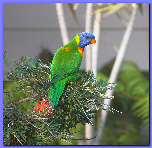
I'm suffering from border disorder. OUCH! I generally like a tasteful border but this one doesn't seem to being doing anything positive for the image. I really like the composition and the exposure is right on. I think the image could use more contrast to better accentuate those beautiful feathers again those curly leaves. Good Luck!
The blue border is horrible - it weakens the impact of the blue in the image. Compositionally though, there is some interesting stuff here. There are three obvious elements to consider - the bird, the foliage, and the white lines - and those white lines are the most immediate impact here. They might have made a useful compositional element, had you, for instance used them to balance the bird in frame, but here - where they appear to be an unconsidered background element - they just annoy the eye.





 Add photograph to your favorites
 Add photographer to your favorites


