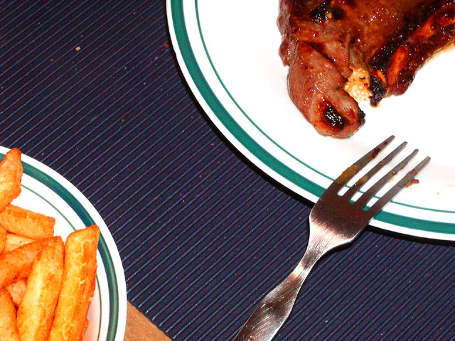
This was actually a very easy recipe. All I really need to do was marinate the pork chops and cook them.
Ok, so buy one of those 30-minute marinades, I used a Honey Dijon one from KC Masterpiece. Then place the pork into the marinade so that it is coated on both sides for at least a half hour in the fridge. Then afterward place the pork chop in a pan and broil is for 8 minutes on each side. The fries were even easier, these just needed to be baked at 425 F for 18 minutes. That was extent of my dinner. Hope you enjoyed it, it tasted really good.
Statistics
Place: 50 out of 58 Avg (all users): 4.5395 Avg (commenters): 6.0000 Avg (participants): 4.3478 Avg (non-participants): 4.6226 Views since voting: 1360 Votes: 152 Comments: 16 Favorites: 0
Looks very yummy. But the cropping leaves me wanting on this shot. There is too much space between the plates and tehe dirty fork, though indicting that a bit has been taken is really distracting in the end. The colors are wonderful, the lighting is nice and bright showing off your subjects so an 8 for this one.
The fries look delicious, the pork chop looks suspicious. Imho showing more of the chop might have made it more appealing - and, again my own taste, I would have used a clean fork.
Very nice job on the placement of the plates. I like the in the corners like that. The lines on the placemat form nice diagonals. Looks like it might need a little USM. And a nitpick - the crumbs on the placemat are a little distracting. But, I can't talk much 'cuz I'm messy. :-)
Innovative composition. Just caught the rule of thirds. Gets a 9, though, only because I feel that you needed to bring the meat in just a tad closer. I think there is just a bit too much 'table' there and it nearly distracts. My opinion, of course
I like the arrangement of the foods, with the fork sort of 'bridging the gap' so to speak. However, I find the colors a bit off (makes the meat look a bit unappealing), perhaps the lighting? Or hue changes? Background is nice and uniform - maybe would've tried to move some of the crumbs and cover up that bit of wood with the plate at the bottom left. I bet the eating part was fun! 5
Good Points:creative thinking with teh composition
Bad Points: sadly it doesn't work for me, if the plates were closer this would be much better I feel. Also the food on the fork doesn't look pretty
Overall Score:3
good try at "abstract dining" i have two suggestions: wipe the crumbs off the tablemat, and pull the same down a little so that you don't see the wood table. Those two things, imo, would have given you a higher score from the "stock photography group" here at dpc. Personally, that gets old for me. I like your impromptu creativity. I don't think theres a enough of it around here. Cool shot, nice work. 7.





 Add photograph to your favorites
 Add photographer to your favorites


 Photographer found comment helpful.