I like the idea here, but the whites are over exposed. The little peek at the pot isn't necessary. A tighter cropwould elimate some of the clutter. Could be a little better planned out, to make it simpler.
Hope this helps.
Regards,
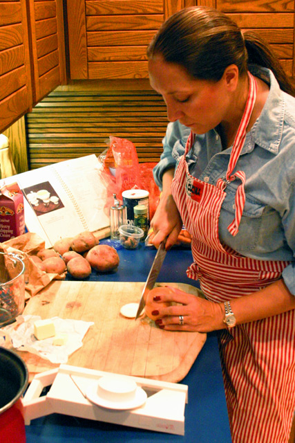
This picture looks very red on my monitor. Did you set the applicable white balance? Otherwise, it's a very pleasing picture with all the ingredients layed out and her bright red apron.
When is dinner? ;) A nice shot, good compostion overall, well balanced and good cropping. The clarity is lacking a bit and the lighting seems a bit harsh. Her concentration on her task is a good study of human nature. :) A 7 to start
Like the composition here, but it is a touch busy. The focus is a touch soft (were you trying for that effect?) bud DOF looks good! The whites are blown out so you can\'t see any details also. This is especially noticable in the cook book!
We really don't get to see much food in this shot at all. The main focus seems to be the cook, and that's not really what the challenge was meant to be. I see some potatos and butter, and some salt, but not really much actual food to look at. I realize that this does still fit the challenge by being the "during" of preparing the food, but wish that there were a bit more food in the shot. As for the shot itself, the red tones seem to be jacked up too far. Her skin is an unnatural color and the overall shot seems to have an orangish red tint. ~Heather~
Great set up, everything is placed well. I would've liked more of the items on the left side to be visible (not so tight a crop). The energy is great, looks realistic not over-done or fake (whether she's actually posing or not). My main complaints are the focus of the whole scene feels soft to me, and that slight blurredness is distracting. Also, I'm not sure if it is the lighting or what, but there seems to be an oversaturation of hue, there's a yellowy/red tone that is looking overloaded to my eye. 6





 Add photograph to your favorites
 Add photographer to your favorites


 Photographer found comment helpful.


