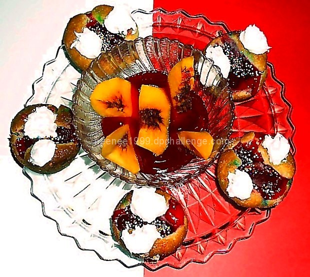
milk, eggs, sugar, flour, oil,strawberry pie filling, blend milk, eggs, sugar and flour, pour into pan add peach juice to the batter, add strawberry pie filling in the middle of each and bake at 350..then add butter cream frosting,
Statistics
Place: 42 out of 58 Avg (all users): 5.2418 Avg (commenters): 5.5263 Avg (participants): 4.8478 Avg (non-participants): 5.4112 Views since voting: 1184 Votes: 153 Comments: 21 Favorites: 0
The overall arrangement is nice, and I like the two-toned background. The cream dallops lack detail; more oblique lighting might have shown off their texture better.
Okay, I just ate and here you are making me hungry.... The one thing I would suggest is that a softer light source would have helped - there's a lot of reflections/glare, and it looks a bit splotchy (probably because of the shapes that are catching the light). The presentation as you set it up is so pretty.... (Now, for voting to finish so I can see the recipe!)
The presentation is very nice and I like the split color background. Unfortunately this looks quite oversharpened...and/or maybe the lighting was too strong? The shine on the jelly is quite bright. Other than that, this is very good.
I think there are too many things going on in this photo. With a recipe this complex I think a plain background and plain dishes would have been better. Makes me hungry though :)
I cannot wait for this recipe, I love peaches and strawberries! The brightness of this shot makes it jump out but once you get here the sharpness is a bit much and the tabletop is very distracting being cut in half with color. I would have gone with all red on this one, the white ends up blowing the plate out and being distracting. I'm starting with a 6 on this one but I will be back.
I like the composition and the idea, but the image looks out of focus or maybe too much light reflecting off the glass plate, or maybe too much light was used, or resizing for the web may have cause some pixelation or softness
I like the arrangement a lot -- unfortunately the overall quality of the shot seems to be lacking a bit. I'm not sure if you used a flash here, but it seems like the overall image has a bit too much contrast and is a bit blown out in spots. The idea of using the red/white background is great, though.
Looks decadent! The background detracts from the composition to me, and the image has a harsh edge to it to me, like its been too contrasted or over-sharpened? I like the presentation of the image - very balanced and well thought out. 5
Looks tasty, but I find the image way too busy. Something needed to not be there, either the background or the patterned plate and bowl. Everything is getting lost.






 Add photograph to your favorites
 Add photographer to your favorites

 Photographer found comment helpful.


