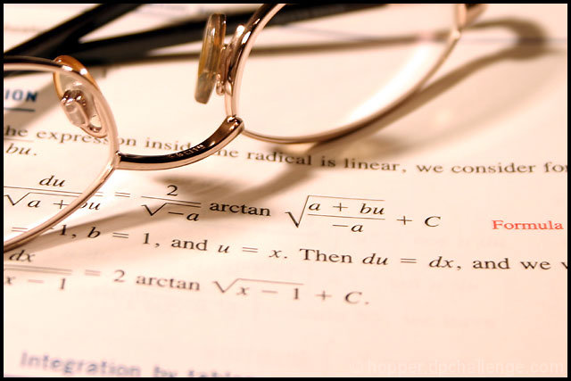
That's a neat photo. I like how the glasses are sharply in focus, but it would have been really neat if you found a way to throw the book way out of focus so that things were only sharp through the lens. (And bonus marks for getting the glasses sharp too).
I like the glasses, and for the most part, the composition. By the most part I mean that I personally would have liked to see at least one more prop. Maybe a pencil or a compass. Something else off center just to add a little more to the composition.
Normally I don't care for photos of a written page (in any competition) as I think it's just a lack of imagination. But your title made the difference becasue it "made" the glasses and book the actual study being done. (Hope this makes sense). And, obviously, you nailed it technically. I gave it a 9 only because I think that with experimenting with focal length you could have gotten a bit more of the text in focus, up front there. I think the hard focus area needed to extend to the '2 arctan' line as that area is still very close to the eyes natural focal area when viewing a new image. Out-of-focus past the leading edge of the glasses is fine. I agonized over this one for a while (I rarely write comments). Very good photo, very pro. I could see this as part of an ad in Scientific American or something. I'm sure others won't feel the same, but I like it.






 Add photograph to your favorites
 Add photographer to your favorites


 Photographer found comment helpful.


