Author Thread
Post actions
Always the artists eye you have....nice
Comments Made During the Challenge
Post actions
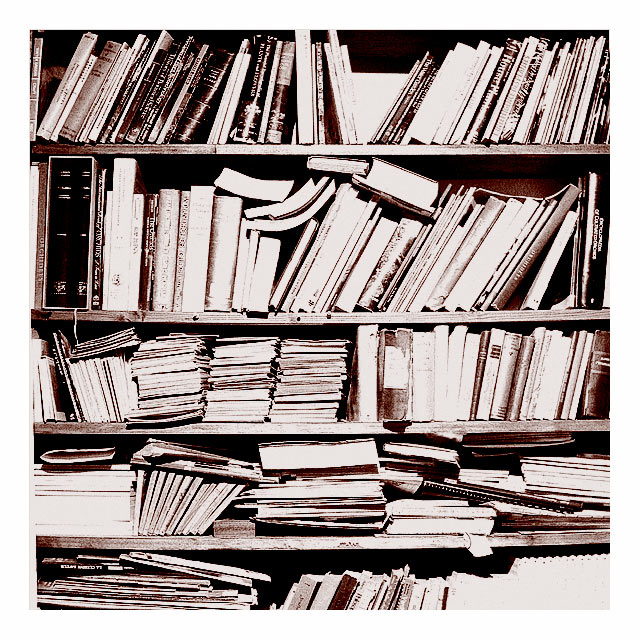
I like the exposure value, but I think it would be better with only the top 3 bookshelves.
Post actions
I like how the color is. It gives it that old-timey look, along with the messy book shelf.
Post actions
haha every scientist's office looks like that. oh i could swear that looks like my advisor's office.
Post actions
The thick border somehow works witht his shot. 7
Post actions
I like your idea here, however it seems a touch over-exposed.
Post actions
picture seems a little too busy. There isn't really anything to grab attention.
Post actions
Interesting photo - I think the sharpness or contrast is a bit too high, the colors are great and composition as well. 8
Post actions
Nice. I think I would have trimmed this down to the first three shelves, 4 & 5 seem a little too disorganized for me. Good idea.
Post actions
good idea but the harsh lighting overexposes the spines and pages of most of the books.
Post actions
Love the metallic tone of this photo. 8
Post actions
Good idea. This could have scored higher if it wasn't soooo overexposed. The wide white frame seems to make things even worse. A plain B&W picture would have been better.
Post actions
Looks like my husbands den! LOL Neat shot but a little oof to my eye. I do like the tones, just a might bright here and there.
Post actions
Nice grainy overexposure. Love the contrast. I would buy a large poster sized print of this- that may be my only criticism- its poster-themed with out a focus- but hell- its better than my stuff! good job!
Post actions
Great picture! I love the duetones
Post actions
Sepia works fine, but i'm not sure with the overburning.
Post actions
I love this! The brightness..contrast..sharpness..wow. 10
Post actions
the contrasts really make this photo






 Add photograph to your favorites
 Add photographer to your favorites


 Photographer found comment helpful.


