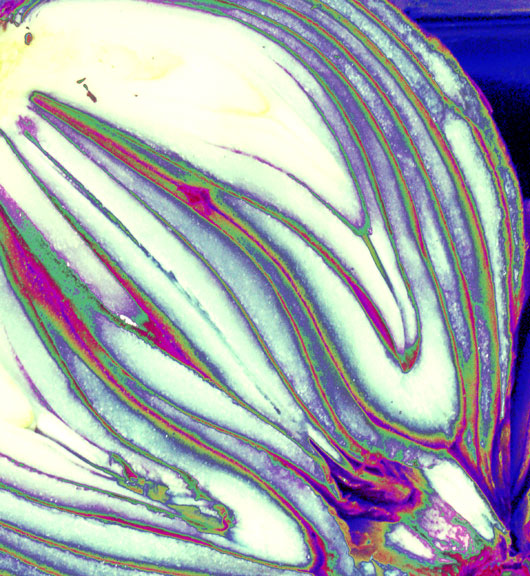
The FX here are inappropriate for the subject in my view. As a macro it shows no clear detail and as a design it is a little crude - sorry! It's a shame because this is a good composition otherwise. You'll probably score low with this because people will be wanting some shots that look appetising.
I'm not really big on the psychedelic colors in this example. I can't really tell if the focus is good or not. It does look a little blown out on the top, center to left, part of image.
Ah, a sweet onion perhaps? The colors actually work on this one. Though the blue in the upper right tends to be distracting. But making the colors like you did it could almost be a purple onion! The cropping is well done, the lines draw you from lower right to upper left and it almost makes me want to cry! ;) I'm starting this one at a 6
I don't like this at all. Definatly not my cup of tea so to speak. If you hadn't specified what this was, I would not have even guessed it. Secondly, since I now know it's an onion, I wouldn't think it would have these silly colors in it. It might appeal to some, but not to me. Sorry. Also, whatever effect you used, really made it grainy and aweful in the background part in the upper right.
Wow, very abstract. A different take and look. I like the colors and the way they manifest because of the veins/layers of the onion. I like its uniqueness but find it a bit rough for my personal tastes. Interesting vision. The whites are a bit harsh, not sure if that would've been possible to change. 6





 Add photograph to your favorites
 Add photographer to your favorites


