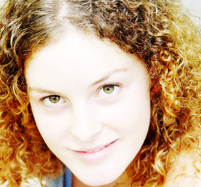
well great promise for this image, but still a few things that bother me. I don't really like how burnt out the image is. i see that you modified the levels to achieve this, but still i think you could have it bright and not burnt out. The cropping seems awfully close to her chin as well. Too close... perhaps if you moved the crop up a distance.. put the eyes on the 1st third.
just some thoughts.
On my screen the skin tone is all washed out and the lips are kind of faded. The eyes are clear and the lashes are fine, but a lot of other parts just seem over exposed.
this was a nice shot but it is way over exposed. Try bracketing your shots and this is from one who doesn't practice what I preach and then complains later.
I think this is a bit too high key for the model's hair. The contrast between face and hair is a bit stark. But the composition and soft focus are great.
Beautiful subject, her eyes are wonderful. The lighting is okay, but I'm torn on whether I like it. On one hand I find it a bit detracting because I want more tonal play from the skin and deliniation of all the features. On the other hand I love how it really brings out the eyes and creates a nice foil for the hair (which in turn also highlight the eyes). Beyond that the only other thing that draw my eye negatively was an odd discoloration on her right eyebrow (possibly weird light glare?), doesn't take away from the image, but it did catch my attention. Excellent photo. 9
Face is overexposed. I know this is a 'lighting' challenge, but in this case, the overexposure washes out any detail. The lighting also doesn't "set the mood" for the image, either, which is also part of this challenge. Noise on bottom of image. I do like the fact that the face fills the frame, and the eyes have nice catch lights in them. Model is attractive subject.
This probably could have been a very good shot with some moody lightng but it just seems to me to be very over exposed which is washing part of your models face out. Better luck next time. 5






 Add photograph to your favorites
 Add photographer to your favorites

 Photographer found comment helpful.


