Challenge:Something Old (Classic Editing) Camera:Konica KD-200Z Location: Terry's car in Pittsburgh Date: Aug 3, 2002 Aperture: 5.6 ISO: 100 Shutter: 1/208 Date Uploaded: Aug 4, 2002
This looks to be very low resolution. Or maybe it is a very small crop from a much larger picture. Either way, it's just too grainy and blocky for me. Sorry.
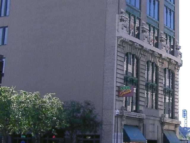
This only just passes my quality threshold, beyond which I start to make impolite comments. But you just made it, so: The whole thing appears lopsided. Youve used the right corner as your guide, but you should have used the nearest one, as that is in the center of the picture. There is a very large area of boring wall and hedge. Use a verticle frame and focus more on the front of the building, as that has more interest. You have chopped the entrance to the building off, it may have been ugly or had cars in front, but do try to show entrances when doing buildings, they give scale, and lead you into the picture. Youve used too much compression, Dont go below 70% comprression for these challenges.
I'll keep this short, left half is somewhat negative space (intensional?) The sky is blown out (intensional, too?) The sign is almost readable. Best suggestion: walk up closer to the building and take the shot in portrait. 6 Swash
I think the sign, since that seems to be what you are focusing on, should be more important in the picture. Also, I think cropping the right side windows would help. I like the way the bushes/tress lead the eyes to the building. karmat
Unfortunately, I'm not sure what I'm looking at. Is it the building or the sign. I'm being very frank in my comments - not to offend. The don't think the tilt is working with this photo. It's hard to comment on something I don't understand. What is the main subject of the photo - the sign. the building structure, the restaurant.. There should be on object in which the photo will guide the eye to. Too much guess work for me. The color is good and the focus. Just my opinion - not to offend. 4 Ruthann
If this place is old, I would have tried to capture its age with a different camera angle... When I look at a building from this angle, I think cutting the entrance way out of the photo is not a good idea. This photo also needs some more contrast and sharpness to come off well... - jmsetzler






 Add photograph to your favorites
 Add photographer to your favorites


