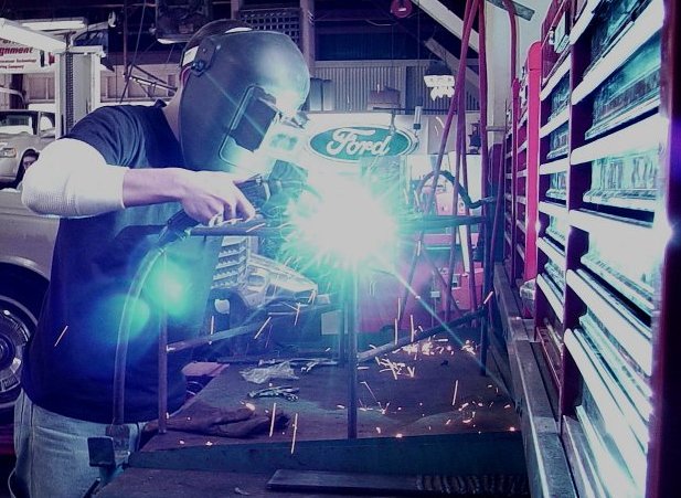
pretty cool. I would have made a couple of changes: adjust the RGB levels a little bit... a little less green/blue and more red/yellow or just less green, and then the blue would be stronger. Also the glare is a bit strong.
I like the image. Could almost be an add for Ford. The one thing I think I would change, however, Is I would crop in tighter from the right and eliminate the shelves. They draw a little too much attention from the main subject. I like the high contrast look that is achieved by the bright light as well.
too much blue around. I would strngthen the sephia away from the welder and work on smaller flares. otherwise good. nice composition. Henry would be proud.
I like this a lot. The brightness of the light centered in the middle of the shot creates nice, clean lines of the worker's hand and clothing and draws the eye up to the sign in the background as if this were an advertisement for Ford.






 Add photograph to your favorites
 Add photographer to your favorites


