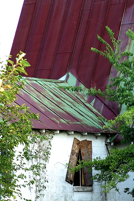
I can't really say why, but I like this photo very much. Nice composition. The photo has an appealing simplicity. To me the house looks old and abandoned. So you met the challenge very good. The way how to roof in the background goes straight up and has these lines pointing to the subject is nice. I also like the broken window halfly hidden behind the tree. Maybe a touch overexposured because the area to the left of of the window is a little blown out, but I see that it was a difficult scene. High contrast between the white wall and the shadows created by the trees on the right side. -stephan
excellent subject choice, and competent technical photo. The large expanse of sharply-inclined roofing makes for confusing orientation. I would probably have cropped the top just a bit to shift attention from that.
Title and picture don't quite match. The building looks in disuse, but from what I can see, it's not that bad. The copper roof appears normal, the patena wear is normal for a 10 year old (or less) building. I like the boardering trees, nice touch. 6 Swash
good colors here. though i wish the highlights weren't blown out on the front wall. also, i cant tell if the green on the roof is a patina or old paint...but it is nice either way. ~mcmurma Aesthetics...7 Meets Challenge...7 Overall...7
the patina is so nice and the vertical piece works well with it. I'm just hating having to look around those branches, though! The rest of it is so visually appealing! 7





 Add photograph to your favorites
 Add photographer to your favorites


 Photographer found comment helpful.


